The Trans Canada Trail brand
The Trans Canada Trail brand identity guide help to ensure the consistent use of elements that create the look and feel of the organization. These include items such as our logo, fonts and brand colours.
Once you have determined the items you need to create (for example, wayfinding signage), contact the Trans Canada Trail Signage Team so they can provide the relevant version of the logo and any additional resources you many require; they can be reached at signage@tctrail.ca.
Design
A well-designed sign is particularly important. There needs to be a good balance of artistic talent and technical functionality. Do you ever look at a very colourful, overcrowded, confusing sign and wonder, “What does it say?” The use of gradated backgrounds, multiple colours, too many words and poor planning makes a sign difficult to read and trail users will lose interest.
For sign design, it is best to keep it simple. This method should be followed for wayfinders and other small markers. Larger signs can include interpretive stories, maps, icons and other pertinent information.
You may need more than one sign should you have extensive copy, photos, and mapping. If your sign has multiple languages or additional content, the design may need to include a QR code or website address to direct the user to read this further information.
An environmental graphic designer, sign consultant or sign company with an in-house designer are great resources. These individuals are experts in all the factors of good sign design, taking into consideration height, distance, speed and lighting to determine the best layout. This may include adjustments in letter kerning and appropriate use of negative space so the sign can be read effectively.
Less is more when it comes to content. Be as brief and to the point as possible. Interpretive storytelling signs should be edited to reduce word counts to the best of your ability without losing the message. If in doubt after the sign’s preliminary design, a digital print can be brought to the site and placed into the planned position. Stand back and view. If you have difficulty reading the information, so will a trail user. Even though a sign looks beautiful and reads well on a computer screen, it may not be effective as a sign when placed in nature.

Size requirements
Viewing distance should be a key factor when determining letter size on a sign, which will impact how big your sign should be. If the sign ends up being too big for its intended location, content will need to be reduced. In some instances, a larger sign may be required due to site conditions or the surrounding environment. The size of the sign will also help determine the size of lettering that can be used in its design.
The charts below provide recommendations for signage size requirements.
| Size (mm) | Size (inches) | Viewer Distance (metres) | Viewer Speed (KPH) | Recommended Uses | |
|---|---|---|---|---|---|
| 200×200 | 8×8 | 5 | 0-10 |
Very short distances, viewer at a standstill. This sign is limited in its uses. May be used near a stop sign at a short viewing distance, near parking spaces, or for cycling paths or footpaths. |
|
| 300×300 | 12×12 | 10 | 0-10 |
Short distances, viewer at a standstill. May be used near a stop sign at a short viewing distance, near parking spaces, or for cycling paths or footpaths. |
|
| 5 | 20-40 |
Very short distances, viewer moving slowly. May be used in residential zones with low speed limits, parking areas, or for cycling paths or footpaths. |
|||
| 450×450 | 18×18 | 10 | 40-60 |
Short distances, viewer moving at town speeds. May be used in urban or rural roads with low to moderate speed limits. |
|
| 25 | 20-40 |
Moderate distances, viewer moving slowly. May be used in residential zones with low speed limits, parking areas, or for cycling paths or footpaths. |
|||
| 600×600 | 24×24 | 25 | 40-60 |
Moderate distances, viewer moving at town speeds. May be used near a stop sign, near parking spaces, or for cycling paths or footpaths. |
|
| 10 | 60-100 |
Moderate distances, viewer moving at high speeds. May be used on rural roads or roads with higher posted speed limits. |
Trail use icons and other symbols
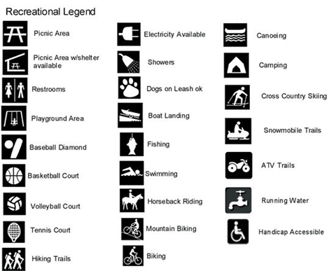
Icons and symbols are the best way to communicate with a traveller. These graphics get straight to the point and inform the user of necessary information. A variety of real-life examples are available that can help you plan your sign’s design. You can find common symbols by searching “International Standards” or “ISO.”
Included are the sample standards for quick reference.
Using different languages on signs
In keeping with Canada’s Official Languages Act, Trans Canada Trail-branded signage is bilingual (English and French), except for Quebec non-federal lands, where it is French only. Quebec has distinct signage laws which should be referred to when designing signage for that province.
Trans Canada Trail welcomes the inclusion of additional languages to its signage to meet local needs. It is important to make sure the translations are done by a certified professional who is accustomed to translating language for signage purposes. If including an Indigenous language, please consult with the local band office for accurate translations. Language errors on signs can be costly, and it is best to have your text double checked for accuracy.
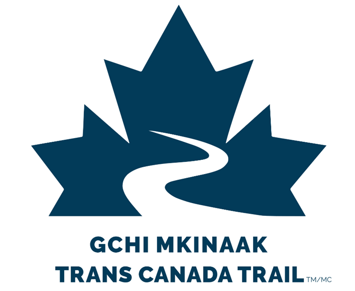
Example of the Trans Canada Trail wayfinding artwork with Anishinaabemowin language for Curve Lake area in Ontario. Gchi Mkinaak means Big Turtle.
Accessibility
Users require comprehensive instruction to ensure safe travel. This instruction is traditionally displayed on access, trailhead, and on-trail informational signs. This information can also be made available on web and print material. It is important for all users, including people with disabilities, to understand any challenges on a trail before starting their journey. To best serve all users, signs should include the following:
- length of the trail
- surface type (including changes in surface type)
- clear tread width (average and minimum)
- running slope (average and maximum grade)
- cross slope (if applicable) (average and maximum grade)
- known trail hazards and obstacles
- cumulative elevation changes (gain and loss)
- all trail uses
- trail rating
- points of interest and distances between points
- audio options
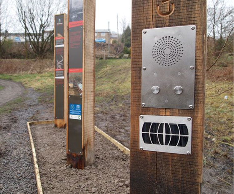
Solar-audio signage feature.
Signage should also include any additional information that will help visitors decide whether or not to attempt a trail. Mapping should include major obstacles or barriers, hazards, notices of a detour, cautions during inclement weather, as well as the location of accessible washrooms and facilities. Adding contact information for the trail manager may also be useful. Trail groups are encouraged to consider a variety of communication formats, including tactile formats for signage content, raised lettering and braille where appropriate, audio tours and additional forms of communication.
The use of ISO icons (previously mentioned in the “Trail use icons and other symbols” section) is also key. The use of the international wheelchair symbol is often used to show which trails are accessible. Sensory gardens or accessible play structures should also be highlighted on maps, web and print materials to encourage trail use for all.
When text is used, it must be high contrast, low glare and sans serif font to ensure that the sign’s content is easy to read. Signs, especially those containing written content and maps, need to be installed at a height that can be viewed by visitors who are using wheelchairs and motorized scooters. Many provinces have, or are implementing, accessibility standards; please check with your local building department to make sure you follow all relevant standards and regulations.
Provinces are developing accessibility standards for outdoor public space. Consult with the appropriate department in your province to ensure that you are meeting its standards and regulations. An example is the Accessibility for Ontarians with Disabilities Act (AODA), and how it applies to recreational trails: https://www.aoda.ca/accessible-recreational-trails-in-ontario/
Click here to review our Best Practices for All Persons Trail: Trail Navigation.
Trail classification
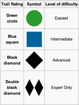
Many trails now indicate level of difficulty similar to the approach used on ski hills. The internationally recognized symbols being used are:
- green circle for beginner
- blue square for intermediate
- black diamond for expert
- double black diamond for experts only
Trans Canada Trail offers an audit that can assist you in determining a trail’s classification. For further information, please send an email message to project@tctrail.ca.
Approval of sign designs
Once complete, sign designs must be submitted to Trans Canada Trail for artwork review and approval. Please allow 24–48 business hours for artwork approvals. Artwork can be sent in low resolution JPG or PDF format via email to signage@tctrail.ca.


