 It is important to provide clear and accessible navigation tools for all users. This can be achieved through a combination of signage and navigational technology. By providing these accessible elements for trail navigation, we can help ensure that all users, regardless of their abilities, can navigate the trail confidently and easily.
Jump to section
1. SIGNAGE
Trans Canada Trail Signage Guidelines are to be used as guidance only. Signage and accessibility by-laws change regularly and are difficult to manage. Please check with local, provincial/territorial and federal building by-laws before proceeding with your project.
Trail signage provides essential information about location, distances and amenities. For a trail to be safe and enjoyable for all users, predictable signage is essential. In addition, having knowledge about the availability and type of signage before arriving at the trail will provide visitors with an increased comfort level before and during their trail outing.
General Guidelines for All Signage
- Include both text and simple graphic images.
- Use high colour contrast, minimum font size 16 and use sans serif font. Sans serif does not have the extended design features at the end of each letter so are easier to read.
- Keep text clear, consistent, visible and easy to understand by using plain language. Do not underline or use italics.
- Make signage content available to users before they visit the trail, for example on your website and in paper format at a visitor centre.
- Ensure signs are durable, guaranteed not to fade for at least 10 years and are graffiti-resistant, making them easy to clean, if necessary.
- Ensure users can remain comfortable in all weather conditions while reading braille.
- Be sure to let users know beforehand where braille signs can be found.
Placement of Signs
- Ensure that signs are placed off the main path of travel to avoid accidents.
- Consider height, viewing distance and overhead clearance.
- Ensure slant and text height is readable for all visitors at intended distances.
- Ensure that all signs are placed at a height that is cane detectable.
- Ensure signage is kept clear from overgrowth to maintain a direct sightline.
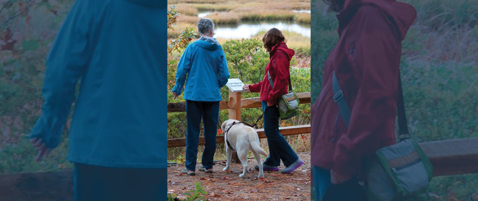
Braille is included on these signs along this trail. This trail features braille on signs along the trail. It is promoted on the trail website, and it is accompanied by an audio tour. Photo credit: Mass Audubon’s All Persons Trails.
- Include a map with the following information:
- Distances between access points, seating, amenities, points of interest and other important locations.
- Washrooms, change rooms, rest stops and other facilities.
- Information resources available (e.g., audio tours, printed maps, etc.)
- Emergency information.
- Amenities and points of interest.
- Grade and cross slope of trail sections.
- Trail surface changes (e.g., paved, natural, boardwalk).
- Consider tactile maps for visitors who are blind or have low vision.
Maps
- Use map illustrations with high colour contrast that are easy to read and navigate.
- Consider printing maps in braille and/or raised lettering for visitor centres.
- Ensure all access points and distances are noted on all maps.
Tip: Know before you go! Ensure maps are available on your website for trip planning purposes.
Colour Contrast
- Lettering on all signs should contrast with the background.
- The colour should ensure visibility in its surroundings.
- Use non-reflective surfaces and ensure lighting does not create glare.
- Use a simple, logical and consistent layout on all signs along the trail.
- Avoid complicated imagery.
- QR codes can allow visitors to quickly scan and access trail information using a cell phone.
- Ensure QR codes are large and visible and can be scanned from a distance.
- Keep in mind QR codes are not accessible to all trail users and should be accompanied by another navigation tool.
2. NAVIGATIONAL TECHNOLOGY
Audio Tours
Audio tours can bring a trail to life for all visitors, especially those who are blind or have low vision. Nature sounds and interpretation, verbal descriptions, historical background, cultural education and navigation instructions are some things to include in an audio tour.
When creating audio tours for your trail, consider the following:
- Creating a tour between 30 minutes and 1 hour in length.
- Restricting the content to 3 minutes at each tour stop.
- Offering tours in different languages to ensure that as many visitors as possible can enjoy it.
- Offering audio tours for various age groups (children vs. adults).
- Offering seasonal versions of the audio tour to provide diverse types of experiences throughout the year.
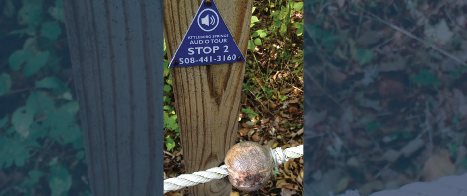
Bring your trail to life with audio tours positioned along the trail. This trail uses beads along a guide rope to signal each audio stop. Photo credit: Mass Audubon’s All Persons Trail.
Technology
- Consider implementing a navigational tool such as Blindsquare, a self-voicing GPS app that delivers information about location and points of interest along the trail.
- Consider collecting accessibility information about your trail. There are several tools available, for example Trans Canada Trail’s Trail Classification Tool, or AccessNow, an app that collects and shares accessibility information collected by mappers with lived experience.
Tip: Ensure that a description of navigational or accessibility tools is included on your website and on all signage.
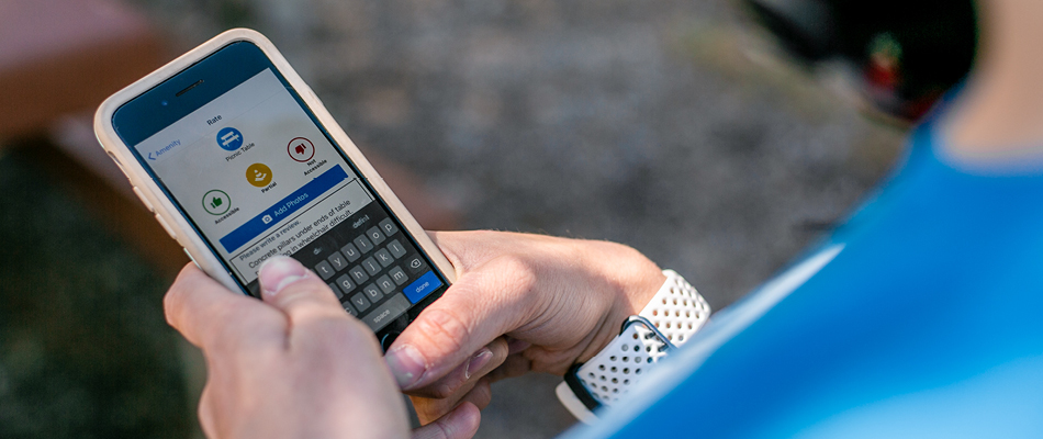
Consider implementing various technology tools, such as AccessNow, to help visitors navigate your trails.
3. TRAIL ELEMENTS
On-trail Features
-
- Railings may be required along boardwalks, bridges, lookouts and other similar infrastructure. Ensure that the railing height allows for viewing from a seated position.
- Consider installing a guide rope as a navigational tool.
- Use colour, edge protection and/or distinct surface materials along the edges of the trail to help visitors follow the path.
- Be creative. Try using wooden or plastic beads to identify seating, audio stops or interpretive features. (Visit the Massachusetts Audubon Society’s guiding system here).
- Consider changing surface materials on different parts of the trail to help users quickly identify where they are on the trail. For example, use one surface material for a primary loop, and a different material for spurs off that loop.
- Where appropriate, ensure trails are well-lit to make it easier to see obstacles and changes in elevation.
- Ensure smooth transitions between trail elements, e.g., between a bridge and the trail.
Tip: Remember that features should be useable in all weather conditions.
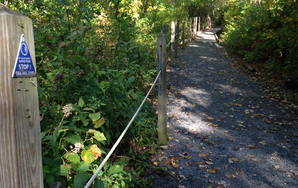
Trail visitors can follow a guide rope along this trail in Massachusetts. Photo credit: Mass Audubon’s All Persons Trails.
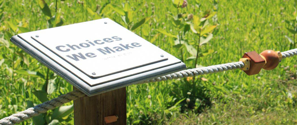
Differently shaped beads placed along a guide rope can help identify specific points of interest along the trail, such as seating, audio tour stop or native habitat. Photo credit: Mass Audubon’s All Persons Trails.
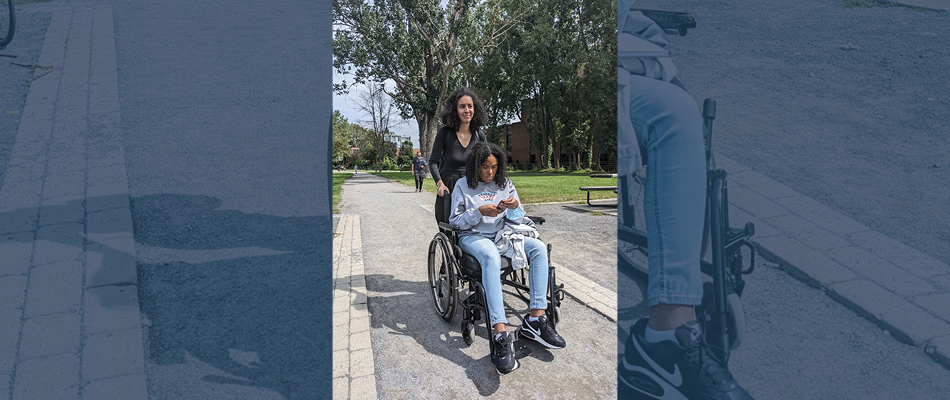
Tactile edges surrounding a trail can be used to keep trail users on the trail when passing areas of high activity.


